Visualizing Variance in Multilevel Models Using the Riverplot Package
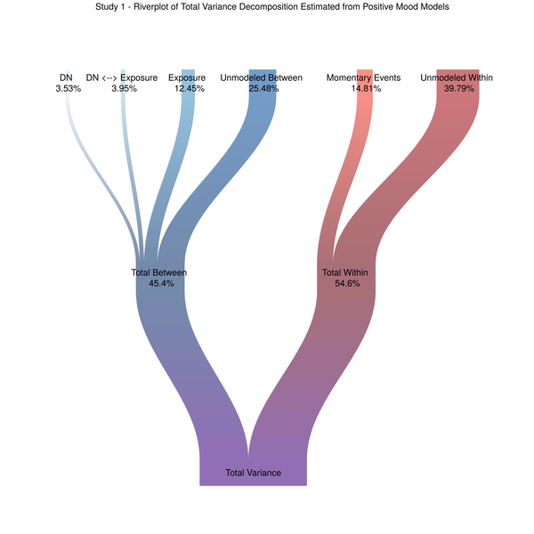
Spurred on by Alex Shackman, I have been working to figure out a good way to visualize different sources of variation in momentary mood. The most common way of visually depicting variance decompositions from the sort of multilevel models we used to analyze our data is a stacked bar plot. So that seemed like a good place to start. Figure 1. Stacked Barplot of Model Variance Decomposition Now, choosing a color scheme that screams “HI I’M A COLOR!